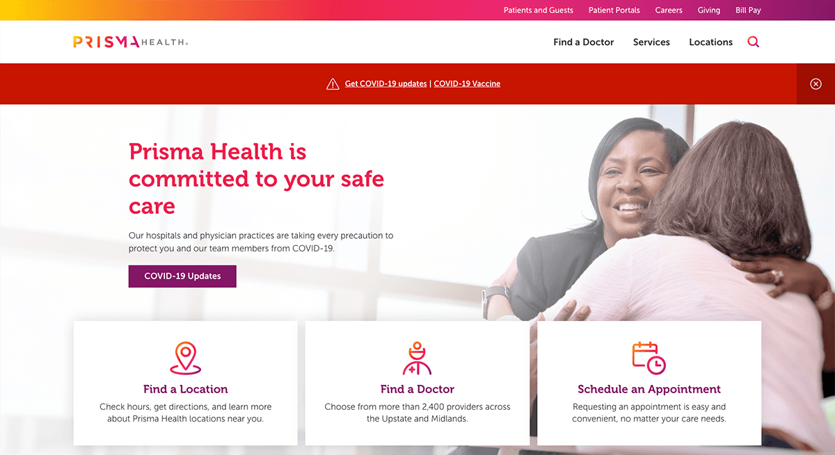
Prisma HealthA unified site for a new health system

Creating a new digital front door for South Carolina's largest nonprofit health system
When Greenville Hospital System and Palmetto Health merged to create Prisma Health—the largest nonprofit healthcare system in South Carolina—one of the first things they needed to do was unite their digital properties under one brand. This started with their primary web presence, prismahealth.org.
Because the merger had expanded the health system, Prisma Health had a few key goals in launching their new site:
Build trust and communicate value of the new Prisma Health brand to ~1.4 million South Carolinians
Streamline content management for their internal team
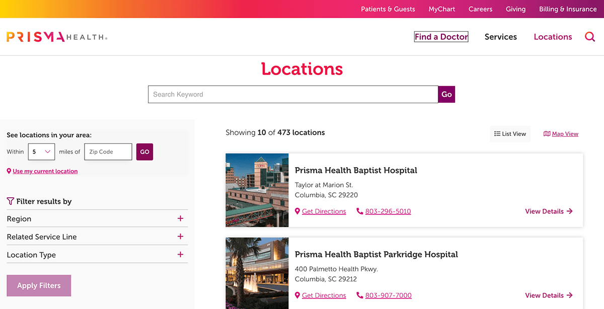
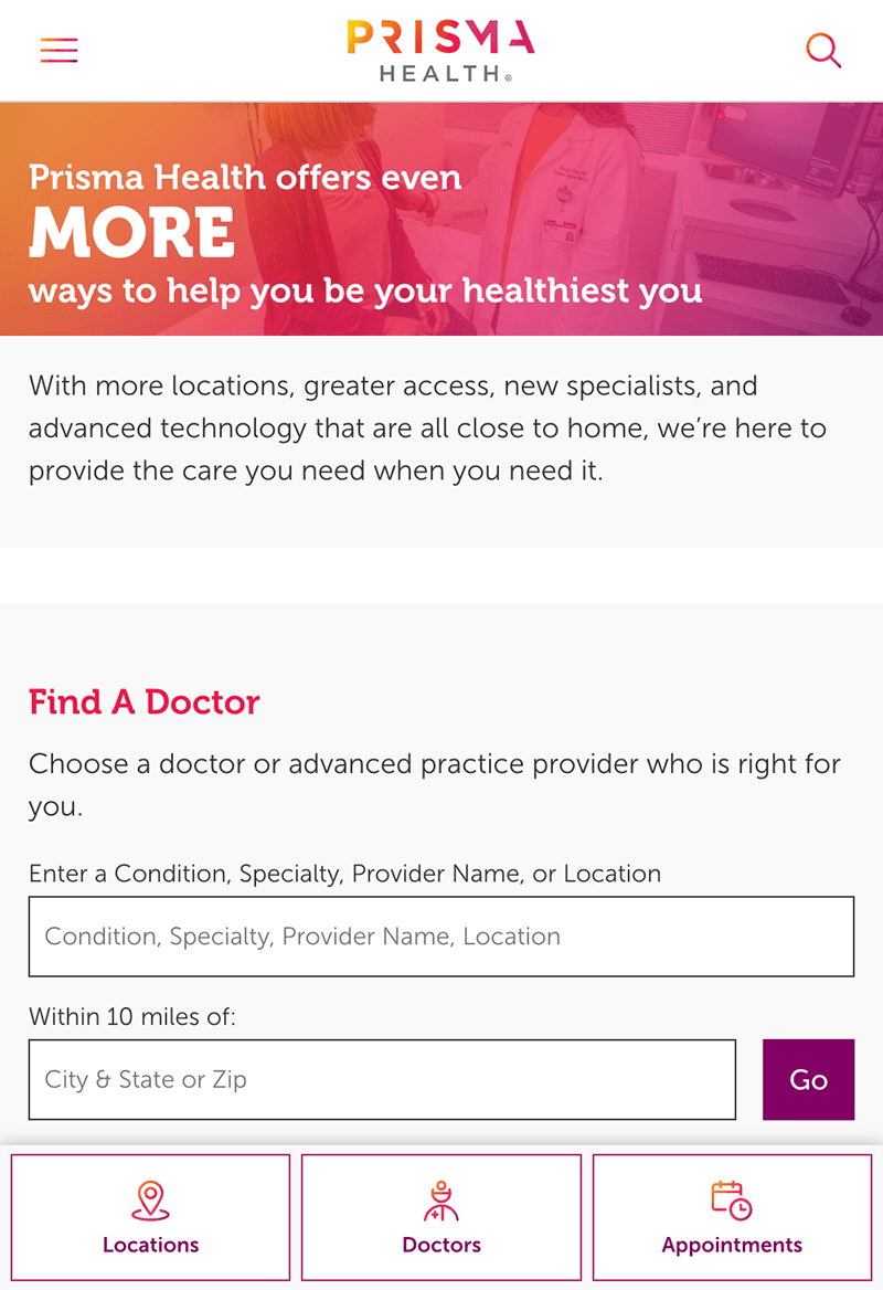
Make searching for locations, services, and doctors easy
Integrate key third-party services that serve both patient and internal needs
New brand, new audience
Our first step was to understand and empathize with Prisma Health's expanded patient audience. What did the new brand mean to them? What sort of experience could they expect from the system as a whole? How can we convey that trust through the website?
We knew that building trust with the new users was a key goal, and the website was a very important touchpoint. Our strategy focused on understanding what users needed and making sure they were able to find that information quickly. This was especially important at the time. The planned launch was during the COVID-19 pandemic, which meant more people needed updates and critical information than usual.
Merging the website
With the primary audiences and their goals defined, we were able to focus on the next challenge—merging the content. Prisma Health had three front-facing websites —the two original sites, plus a placeholder site with the new branding. All had different content, much of which was outdated.
Reason One did a full content audit to determine what content was still relevant, what was obsolete, and what needed to be created. We designed new information architecture to provide a structure for the new content, which aligned with our overall goals of building trust.
The other key goal for merging the website was to make content management more efficient. Even though the old websites sported the new Prisma Health brand, content managers still had to update information in two places. This took extra time, and increased the margin of human error. By bringing the website into one content management system (CMS), Kentico Xperience, their team could now update content in one place.
Under a different project, Prisma Health also combined and re-built their intranet on Kentico Xperience, providing additional overall efficiencies. Both of these projects were executed under Prisma Health's strategic digital roadmap.
Integrations for patient experience
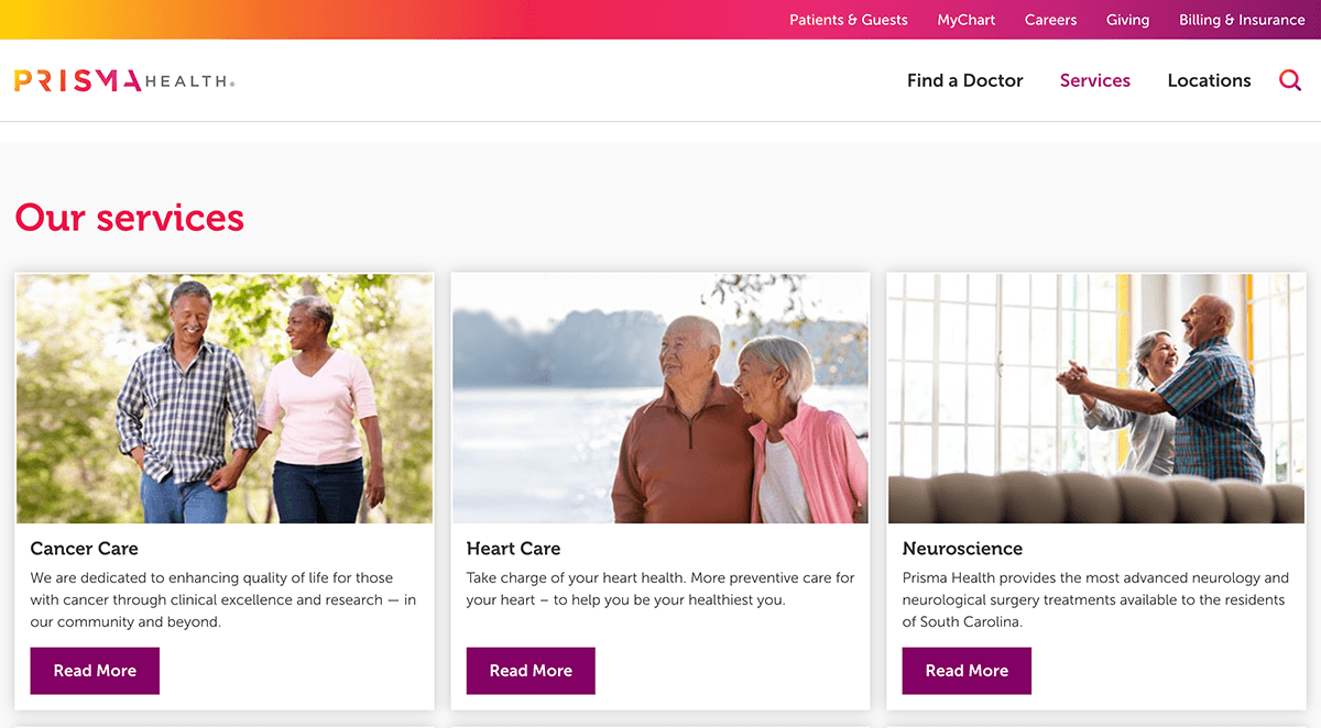
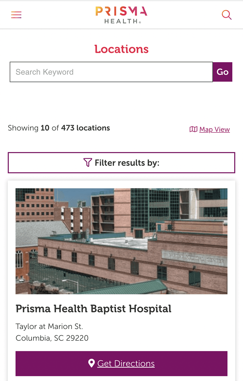
The merger doubled Prisma Health's available services and locations, which made search a high priority for the new website. Patients needed to be able to find locations and doctors near them. To create a responsive search, Reason One integrated the website, built on Kentico Xperience, with Kyrrus, a third-party system.
Prisma Health's website also has several forms to collect patient information. Reason One integrated these forms with Prisma Health's existing Salesforce system to streamline data collection.
The results
Launching the new prismahealth.org website during a pandemic was a challenge, yet it was critical during a time when so many people needed critical healthcare information. This was evident in the data. Post launch, the new site saw:
108% increase in sessions
62%increase in new users
